I think being an artist is having the courage to be original. Many great artists, including Picasso, have all been influenced by the great master paintings...And then finally, they leap, they take off...they become themselves. Then it looks like they just came out of nowhere. Just like 'Pow!'
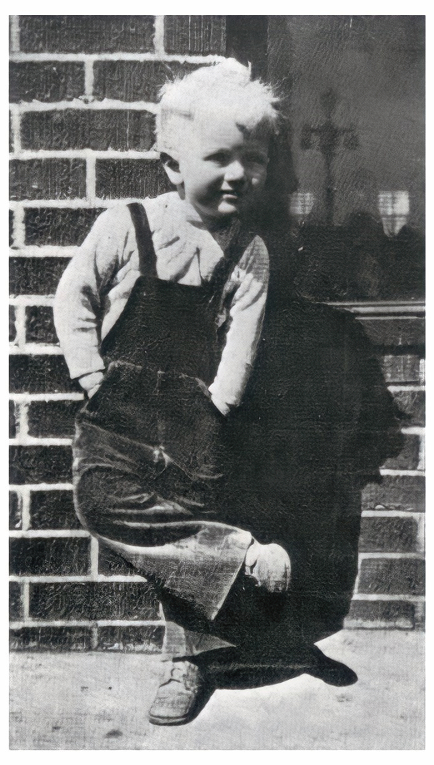
James Albert Rosenquist was born in Grand Forks, North Dakota, in the heart of the Great Plains. The vast distances, with their deep perspectives and the long, unbroken horizon made a powerful impression on his visual imagination, and from an early age he drew easily. His parents moved to Minneapolis when he was nine, and he continued to draw, although he had little formal exposure to fine art in his early years. While still in junior high school, he won a scholarship to the Minneapolis School of Art, and began to consider a career as an artist, but he still had little idea what form that would take. After high school, he enrolled in the University of Minnesota, and began to seriously study the history of Western painting at the Art Institute of Chicago. He found work in the summers, painting commercial signs on water tanks and grain elevators throughout the Upper Midwest, often traveling alone, and taking in the odd juxtaposition of advertising images and logos and the changing landscape of rural America in the early 1950s. He continued to work as a billboard painter in Minneapolis throughout the year.

In 1955, he won a scholarship to study at the Art Students League in New York City, and made his way to Manhattan, the center of an international art scene dominated by the school of abstract impressionism, led by a heroic generation of insurgent creators such as Jackson Pollock and Willem de Kooning. Rosenquist studied with a number of modern masters, including the German exile George Grosz, whose mordant satires of German society between the wars stood at a distant remove from the non-representational abstraction of the New York school.

From all of these influences, Rosenquist had formed the ambition to make a unique and personal statement in art, but first he had to find a way to make a living, and once again went to work painting billboards, high above Times Square. He absorbed the industrial techniques employed by the old hands to work on this giant scale, and carried large quantities of unused paint back to his own small studio. When he took the colors he had used to render beer, spaghetti and movie stars in the giant billboards and tried to apply them to his own canvases, he found himself returning to the techniques and imagery of advertising, but applying them to very different purposes. After surviving a terrifying fall from a scaffold high above the streets of New York, Rosenquist gave up his billboard job to devote himself to his own art full-time. In 1960, he produced the first of a series of major works employing the imagery of advertising art in a fragmented, provocative way that inevitably raised questions about America’s consumer culture.

From his loft studio on a narrow old street called Coenties Slip in Lower Manhattan, Rosenquist mingled with the painters who were his neighbors: Barnett Newman, Ellsworth Kelly, Robert Rauschenberg and Jasper Johns. Like Rosenquist, Johns had moved away from the pure abstraction and improvisational freedom of abstract expressionism into a more rigorous style, incorporating recognizable motifs from American culture. In the early ’60s, Rosenquist’s work was featured in influential group shows at the Museum of Modern Art and the Guggenheim. Along with Roy Lichtenstein and Andy Warhol, he was identified in the press as a leading light in a new movement known as Pop Art.

Rosenquist’s work drew the interest of a number of notable collectors, and he soon moved to a larger studio on Broome Street, in the neighborhood now known as SoHo. He began to incorporate found materials such as barbed wire, plastic and even an automated conveyor belt into his increasingly elaborate constructions. The architect Philip Johnson commissioned Rosenquist to create a 20-by-20-foot mural for the New York State Pavilion at the 1964 World’s Fair, and Rosenquist’s work began to draw national attention.

In his new workspace, Rosenquist undertook his most ambitious project to date. F-111 is ten feet high and 86 feet wide; it was first exhibited wrapped around three walls of the Leo Castelli Gallery on the Upper East Side in Rosenquist’s first solo exhibition. It depicts an F-111 fighter plane, a controversial new aircraft already regarded as a costly boondoggle by critics of Pentagon spending, deftly interwoven with images of assorted consumer products. “My plan,” he says, “was to sell the picture in fragments, so that collectors who bought pieces of the picture would be acquiring a souvenir of an object that they had already paid for with their taxes.” As it happened, a single collector bought the entire set of panels and launched it on a tour of the world’s art museums. Rosenquist’s fame spread across Europe, and he became of one the best-known ambassadors of American art. Many read political meaning into Rosenquist’s work, but for the most part, he distanced himself from overt political involvement, although he was briefly arrested while participating in an anti-Vietnam War demonstration in New York City in 1972.

During the 1970s, Rosenquist continued to pursue his interest in unconventional materials and site-specific installations, with more wraparound canvases, with paintings on polyester film, and on reflective panels in an installation wreathed in dry ice fog. With his reputation no longer limited to the New York art world, Rosenquist began dividing his time between studio spaces in New York and Florida. In 1973, he began construction of vast studio spaces in Aripeka, Florida, on the Gulf of Mexico, to accommodate his ever-growing work, including murals for Florida’s state capitol building in Tallahassee. Rosenquist’s reputation made him a prominent advocate for the arts in American life. After lobbying persuasively for federal protection of artists’ rights, he was appointed by President Jimmy Carter to serve on the National Council on the Arts.

Rosenquist’s creation of the massive (17- by 46-foot) painting Star Thief was documented for a 1981 LIFE magazine story, “Evolution of a Painting.” The finished work was selected for the concourse of Miami International Airport but was rejected by one of the participating airlines, amid a storm of controversy. The work would later be acquired by the Museum Ludwig, in Cologne, Germany. Throughout the ’80s, Rosenquist continued to paint and exhibit large-scale works with imaginative, provocative titles, including: Four New Clear Women; The Persistence of Electrical Nymphs in Space; and Flowers, Fish and Females for the Four Seasons (originally created for the Four Seasons restaurant in New York, it would later be acquired by the Metropolitan Museum of Art). In 1986, his historic painting, F-111, was sold by the estate of its original owner for $2.09 million, the highest price paid to that time for one of Rosenquist’s works.

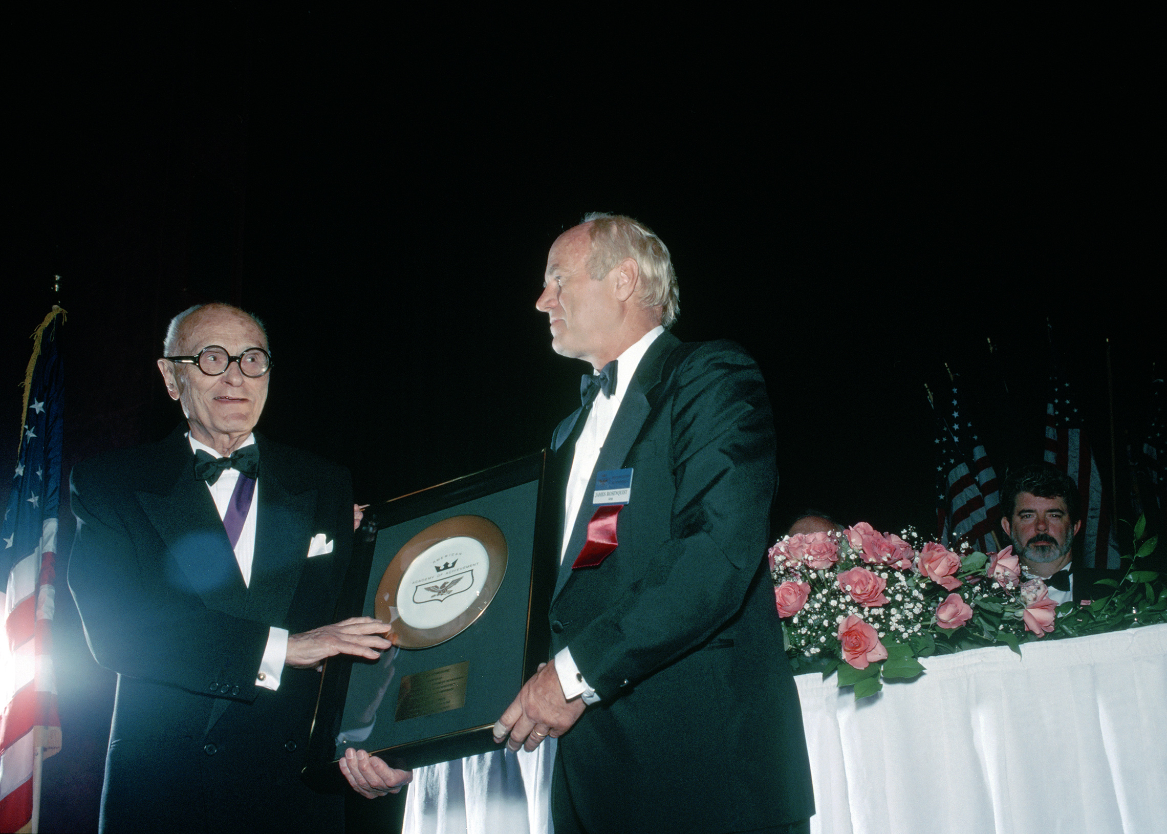
In the early 1990s, Rosenquist was the subject of major retrospective exhibitions in newly post-Soviet Russia and in Spain, where he was later decorated for his services to universal culture. He was later decorated by the governments of France, Italy and Japan. The end of the decade saw him initiating two major series of paintings, The Swimmer in the Econo-mist and Speed of Light. While continuing to produce his signature large works and murals, he maintained side practices in lithography, printmaking, sculpture and collage. In the first decade of the 21st century, many of these were collected in book form. Rosenquist himself was the subject of a number of documentary films, and was featured in two public television series, The Shock of the New and The Empire of the Signs: American Visions. The year 2006 saw the exhibition in Basel, Switzerland of Rosenquist’s monumental work, Celebrating the Fiftieth Anniversary of the Signing of the Universal Declaration of Human Rights by Eleanor Roosevelt.
As he entered the sixth decade of a staggeringly productive and influential career, Rosenquist continued to produce at a great pace. His interview with the Academy of Achievement was conducted in 1991, shortly after his return from Russia, as the country was just emerging from Communist rule. To artists around the world, Rosenquist’s creations have exemplified a clear-eyed and exuberant celebration of the free imagination.

Rosenquist’s home and studios in Aripeka were destroyed by a wildfire in April 2009. Fifteen recently completed canvases, which were about to be shipped to New York, were lost in the fire, along with his extensive archives. He shared his reflections on his long career in an acclaimed autobiography published later that year, Painting Below Zero: Notes on a Life in Art. James Rosenquist died in New York City at the age of 83.

In the early 1960s, James Rosenquist emerged as a leader of the Pop Art movement, employing the techniques of advertising illustration and the imagery of popular culture to provoke sharp questions about the nature of a society steeped in consumerism and mass-produced images.
Through solid academic training and a long apprenticeship painting giant advertising billboards, Rosenquist mastered powerful techniques for rendering the bright, reflective surfaces of industrial products, and learned to work on a massive scale. Breaking with the dominant school of purely abstract painting, he deployed his formidable technical skills to render familiar objects and images in startling combinations. He gained international renown with monumental works, such as the painting F-111. Ten feet high and 86 feet wide, it interspersed images of a jet fighter plane and a mushroom cloud with those of a tire tread, light bulbs, an umbrella, a child’s head in a gleaming domed hair dryer, and a tangled mass of spaghetti in red sauce.
In enormously productive career spanning nearly six decades, James Rosenquist’s work astonished with its brilliance, playful humor and unflagging invention. His unique, original vision transformed our perception of the world around us.
Let’s talk about F-111. How did that painting come about, and how did you decide to make it so huge?
James Rosenquist: That was kind of a culmination of a number of ideas, and one was visiting an amusement park in Texas and seeing a B-36 airplane just sitting there rusting. And then going to an amusement park that had a lot of unnatural things about it as a theme park. And then talking to Barnett Newman about “it” and about seeing something which turns out that a person, whatever one looks at, is relegated by peripheral vision — what you see through the side of your eyes makes what you think you see, that color for instance. Or color can change other colors, according to the whole surrounding of senses of color, light, dark, everything. So that I wanted to make a room where wherever you look, that color would be that color, because everything else made it that color. And that was it. I could really set the knobs and really do that. I learned that income taxes were started by the Chinese as a donation to make a humanist donation to a community or a society. And just at that time, I met Paul Berg from the St. Louis Post Dispatch, who had just come back from some combat missions in Vietnam. So the culmination of all these things. I thought of the economy that this war weapon supported in Texas and in Long Island. So that was the beginning idea to get me off the chair to do this painting. And later it was taken as a great anti-war picture, and everything. But it didn’t start out that way. It was really more of how illogical it was to be an artist in this century, and this time. What a joke it was to be an artist. I mean, if one thinks that they have any power — political power — by being an artist or saying something or doing anything, it didn’t seem to be. The artist’s role in society seemed to be silly at that time.

But at the same time, as an artist you were making a political statement.
James Rosenquist: Not self-consciously, I don’t think. Not at that time.

People were shocked when they first saw your art in the early ’60s. It seemed to go against the grain of everything we had been brought up to feel about art. It was very audacious to use commercial, mass production images. Why were you so taken with this revolutionary approach to art?
James Rosenquist: I don’t think it’s really revolutionary. It shows occasionally in our history, like in the “High and Low” show, there was a Joan Miró painting, a beautiful Miró painting, and the inspiration from that came from clipping a little picture of a knife, fork and spoon out of a catalogue somewhere. And he used the positive-negative space as a sketch, and then this became a big beautiful painting. It was very atmospheric and very unusual, and the knife, fork and spoons were transformed a little bit into funny shapes, but they were still from that. It showed the daring.
People have always been searching for an idea, or a reason to get them off the chair to do something. So during the time of Abstract Expressionism, a lot of students were merely taught to be careless with abandon. Hit the canvas with a rag, with a broom, with a brush. You know, that’s called “tachism.” After you’ve made a mark on the canvas, does that mark suggest an inspiration, you see? Then you have to have the responsibility to finish something and do something about that mark that you made, because you destroyed a beautiful painting surface. So, so many people were being taught like that, that the brushstroke — the viscosity of paint — became a cliché. That’s one thing, that people became tired of that. So also, tired of an abstract painting being misinterpreted into something else. For instance, something that could be very ethereal looking and very unusual looking could have a figure of Popeye sitting there in the middle of it, but the artist didn’t really see it. Now that’s maybe a bad artist for having something in there that they didn’t want. Hans Hofmann would never have done that. He was a sharp old duck. He knew what he was doing. But a lot of people would slip, and flip, and then you could see the strangest artworks coming out. So people, so called Pop artists, a lot of them were commercial artists. Roy Lichtenstein did drafting, I was a billboard painter, Andy Warhol was a commercial artist. And others.
Do you think there was a reason why this happened when it did? This sense of making serious art from sources that had not been considered serious art?
James Rosenquist: I can’t put my finger on that one. I don’t really know. One could say that abstract painting up until 1945 or 1950 really had its roots in Europe, from French non-objective painting. One could say this looks more American, which has less roots in Europe. But I don’t want to say that, because I don’t see enough reasons for that. It would be a self-conscious attitude, like saying, “Hey, I’m going to do this now because I hate Europeans. I’m not going to be like that. I’m an American.” I don’t see that.

Did you feel that you were part of a movement at the time?
James Rosenquist: Well, Lawrence Alloway coined that term “Pop Art.” We were also called “New Realists,” and a lot of other things. I think it was a misnomer, Pop Art. Lawrence Alloway seemed to think that everyone was infatuated with popular imagery, which I don’t think was the case. The strange thing is that since 1960, that art has still remained popular. People remain interested in it. Also, the artists involved have been very lucky to have a rather long life, with the exception of Andy Warhol and Öyvind Fahlström. But they’ve been pretty lucky. I’m lucky to have a rather long career.
There’s a fascinating collision of seemingly unrelated images in so much of your work, starting in the ’60s. How did you want people to look at these incongruous images? What did you want them to feel?
James Rosenquist: Well, I would like them to realize how much can come out of a little paint pot! Just open up a little pot of paint, it flies all over the place! That’s a thing that students don’t know.

I’ve taught very few times, but when I’ve been to a school for boys and girls, they’re trying to make an expression from a little tube of paint, and they don’t know how to mix paint or do any of that, anything practical. So they get very frustrated. And they take a cigarette, they put it out in the mess, and they go home. And everything is dirty and a mess, everything. And so I show them how to take the paint out of the tube, and smear it up, and how much space they could cover with just the little bit of paint in that tube. I show them how to do that, and after a while, they could make these big beautiful abstract paintings, and I said, “Fantastic! Now you have to have an idea, that’s the next part.” But it’s the same with film. To be able to use it, to be able to do it. To be able to light things, to be able to do all that takes someone to show you the knack of how to do that. It’s craft.
Speaking of incongruity, let’s talk about I Love You with My Ford. There’s a big mass of spaghetti, a pair of lovers, and a Ford.
James Rosenquist: The front of a car, yeah. That really was just an electronic focal vision. It was like short ends of film or something. It was just another kind of composition where you just see this here, and this there, and this there, and it’s that simple. Just bing, bang, boom, instead of the old Renaissance structure and push-and-pull composition. It’s like the eye just picks out, looks at things. I don’t know how to describe it. It’s like a pointless electrical computer. It just picks out whatever it wants to pick out, and it doesn’t push this composition to the left, and move this composition up, and move this around. My mind doesn’t work that way.

It’s a startling effect, standing in front of one of your paintings. I gather that you want to jar people with your art. You don’t want them to just stand there and think, “Oh, what a lovely composition.”
James Rosenquist: Well, I think they’re lovely! I think they are lovely, quiet compositions. I think it is all in how you see things. I don’t know what’s jarring anymore. I mean, you could say, “Well, there’s a landscape painting from the 19th century, it’s gorgeous.” Whatever. As time goes by, I don’t know what’s jarring. Artists have always looked for brutality aesthetically in their work. For instance, a French Impressionist painter would go out in the field, take Van Gogh, for instance. Go out in the field, and he’d make a painting, and he’d bring it in, and there would be little pieces of grass and straw in it, and he’d bring it inside a house. Now, wrenching something from nature, transforming it by bringing it into a sitting room or a dining room or a house, is a big brutality, a big strange thing right there. That’s strange. From doing something aesthetically, out in a field, next to a straw stack or something, and then transforming that by bringing and taking pieces of grass in it, and putting it in a living room, this powerful piece of nature out there that is done — not nature — from nature, is already terrifying. It seems very, very strong and unusual. It doesn’t go with the furniture. It doesn’t go with the wallpaper. It doesn’t go with anything. So that originally was very shocking and brutal. It seems like every generation of artists has been looking for that kind of transformation.

And in your case, a six-foot-tall fingernail painted red is a shocking thing to see in a living room.
James Rosenquist: Well, it’s a fingernail cut like a pen point. I don’t think it’s very shocking. In a room? I don’t know.
When I started painting, I thought my pictures would stand out, because I would be in a group show with other kinds of artwork. And then what really happened was that my work was grouped with Andy Warhol, Roy Lichtenstein, Claes Oldenburg and so forth, and so on. So it didn’t stand out as much, because that was the terrible temper of the times. Now, who knows what is shocking anymore? I really don’t know. How can anyone shock anybody now? I’m sure they can. Or what kind of vision could a youngster put on a two-dimensional canvas or surface now? And I think there is millions of things to do. A lot of people say, well, it’s all been done. Not true. You think of every artist, if they seem to start in a group, if someone calls them a group, their lives send them out in diverging paths, and they get further and further, their whole artwork becomes further and further away from each other. That happens with every group. They seem to start with similar enthusiasm, but then as they grow older, it’s much more divergent. Their paintings start to look quite different, and much, much different. If you look at all the Abstract Expressionists, so-called Abstract Expressionists, like say Mark Rothko and De Kooning and Jackson Pollock, how different they all are. It’s too bad they didn’t get to live longer. Pollock died when he was 45 years old, I guess.

James Rosenquist: Yes, of course. Of course. Of course he was. I never met him. I think I saw him once — but I never met him — at the Cedar Bar. Students would go to a Miró show and a Pollock show, which would be simultaneous in Manhattan. And they’d say, “You know, Pollock, he’s terrific, but you know, it’s really Miró. He’s really the genius.” Pollock was influenced by Miró. And you’d see something by Andre Masson, and you’d say, “Pollock, he’s terrific, but really, you know, Andre Masson invented it all. He’s the one.” Then, when Pollock had this big show, after he was dead, at the Museum of Modern Art, his work was showed chronologically, and at the end these big paintings occurred and he sort of went up and out the window! The show was really the spirit of a great person and a great artist. He went out in a blaze of glory, even though the last few years of his life were difficult, unlike the performance curve of a lot of artists who are very expansive at some points and then they go back down again. Up and down and up and down. So sure, he was very, very important.
When you moved to New York to study, were the other New York artists role models or inspirations for you?
James Rosenquist: The artists who I respected who were living in New York were really ne’er-do-wells, and they really… Let’s say like Bill de Kooning, the artist, he wore an old pair of bib overalls, he had a cheap loft, he painted seven days a week, 11 months a year, and I think one month out of the year he’d get totally drunk. Then he’d go back, that was his vacation. Then he’d start all over again. And his habit was… he was really an extremely hard worker. Other artists, like Franz Kline, had big underground reputations, but they didn’t seem to… you know, they certainly weren’t living any kind of fancy lifestyle, or any kind of luxury. They looked very poor. That seemed to typify the Abstract Expressionist artists. So it was very difficult to see them and meet them, and wondering if this was any kind of a life to have, because it seemed so bad. But however, it was private. It was totally private. The luxury seemed to be if one could live in a metropolitan city without having to deal with it, and just having enough money, not having to deal with it, you could really walk around and enjoy life. And that was also the time of the “beat generation,” where people hitchhiked around a lot, which I did. I moved around a lot. I mean, at one point, I had an apartment for 30 bucks a month, a studio for 45 dollars a month, breakfast was a quarter at the Students Institute: two eggs, toast and tea. I didn’t have any money, but I was rich! That was the feeling. That’s really impossible now to do that in Manhattan. At the same time, in other cities in the United States, it was more expensive at that point than it was in New York. A person could come back from the Army, could come back from something, could start in New York, very cheaply, and get a footing. Not anymore, I don’t think. It’s very hard. I think other parts of the country and other parts of the world are easier.

What inspired you to create your own very distinctive style?
My first inspirations, first starting, was that I thought I could devise a new space, from painting outdoor billboards in Times Square. And that was, as a kid I was subject to Rinso White commercials, early television commercials, our commercial society, which was quite unlike Russia, for instance. And I thought — my job was to paint big pictures of movie stars, and to paint objects to sell, and if I could paint them really well, the company would sell them, and if I didn’t, I’d get fired. I had to paint beer to look beautiful. I had to paint beautiful beer, beautiful shirts, beautiful everything. So a salesman would come in and say, “That beer’s got too much hops in it. Tell that kid to change it. Gotta change it.” So that only meant me making a slightly different color yellow, and repainting the whole damn thing slightly. So I’d take that beer with too much hops in it, that color, which was only yellow, I’d take that home with me. And I’d take Franco-American spaghetti orange, I’d take that home. Which was like red dye number 2 and yellow. I’d take that home and I’d make abstract paintings out of these. And then I thought, “Hey, I’ll use imagery, magnified imagery that spilled out of the picture plane, and I’d set it up so the closest thing you would see would be recognized last, because it would be too personal, and it would irritate people. So that’s how my so-called “Pop Art” paintings started. And I really used generic things, unlike say, Andy Warhol, who used Campbell’s Soup. I painted spaghetti, I painted soup, I painted hot dogs, jeans, I painted cars, all kinds of things, really generically. I didn’t care about the labels.

Where do your ideas come from? Do you work every day or do you need inspiration to start a new painting?
James Rosenquist: Sometimes a title might occur to me. And a title will just stick out in my mind. And then I will think in terms, everything I think of I will think in terms of that title. For instance, I did a painting called Four New Clear Women. It meant, if women became powerful, and they are, like women who own large stock in the stock market, or become president like Golda Meir or Margaret Thatcher or Indira Gandhi, will they be “New Clear Women” or “Nuclear Women?” Will they blow us up, or are they smart? Something like that. So, then I met — there was this actress named Liv Ullmann, and she started painting. And she said, “Oh, what are you going to do next?” And I said, “I’m going to do The Persistence of Electrical Nymphs in Space.” And she said, “Oh, what’s that about?” and I said, “Well, that’s the sound of all the souls after the earth blows up.” And she says, “Oh, yeah.” That was very… she probably talked with Ingmar Bergman about that. But that was great. So those are titles that I would think about, before I would start working. Then, to think about how young people want to live in the future, too, is another interesting thing. People are animals, and still have all the vestigial… I mean still have all the vestiges. I mean they have claws, fangs, ears, noses, just like animals you see running around here. And then you go to New York, I see beautiful girls that have claws, fangs, noses, everything. And I see they are very sophisticated, and they smell nice, but they are still animals. So I wonder, how will a young person like to live, in a really high-tech environment, like say in a rocket ship, or in an apartment, or a business place like that, or would they prefer to live a pastoral life, like little lambs in a meadow? Would they like that? So I think that’s curious, what the future generations will select as an environment.

I mean the environment is going to hell. There’s oil slicks all over, and Saddam Hussein burnt oil fields down, and all of that, and one wonders, “Will people get busy cleaning it up? Or are they interested?” Or whatever. It’s curious. So I’m interested as to what people will select.
I started making a painting that looked like people reincarnating into flowers, or starting to be intermixed with flora and fauna, and machines too. They were sort of pieces of flesh starting to be connected to machines, or to flowers, and I did those, and the images cut in shards so that with the least amount of suggestion, you could see an image of something, yet there was a whole ground to put another image in. There was a lot of area left over. And then that would be a specific image. And then the mixture of both of those, I was hoping for a third image. It would be as if… all artists have cross-hatched, including Michelangelo and Rembrandt and everybody — and that’s like scribbling, “Chhh chhh chhh” like that. And in those scribbles, I was doing one day, and in that, I thought, “Hey, in this cross-hatching, I could, like this for instance, put two images, overlap like this.” You could see both images at the same time and still have more area to paint in. And you could even describe with pieces of imagery, which no one has done before, yet. So, I mean, using imagery as a sketch to describe another image. That would be really confusing, or illuminating. So that was one inspiration.

Do you feel like art chose you more than you chose art? That’s what we’ve heard from some other artists and musicians.
James Rosenquist: Well, if a person is born with talent to do a certain thing — I mean, can draw — it’s like the pronator muscle, like from mind to pointer. And being able to point and describe and even draw something simple, like a map — or that ability to point, to shoot an arrow, to shoot a gun, to describe — if someone has that, that’s talent. And then the next thing is to have the spirit to do something else. And I know. I was in Russia. I had a big show in Moscow recently, in January and February, and there were a lot of people who could draw well academically in there but didn’t have any spirit. It was missing. And they are really subjugated, and put down. So it takes a couple of things. It takes sort of an outgoing — well, not necessarily outgoing, but it takes — besides being able to say it, there has to be some need to say something. And again, there are a lot of people who have a great urge to say something, and don’t know how to do it. And that comes out too. That comes out in other forms. And it’s hard to say one is more valid. But I like defined performance.